Inputs
Chart scoring uses candle data around the call time and liquidity at (or near) the call timestamp. OpenKol anchors analysis to the call timestamp, then measures outcomes in consistent windows such as:- first 15 minutes
- first hour
- first 24 hours
- first 6 hours for “time above thresholds”
Core metrics
OpenKol computes a core set of metrics like:- 15m pump: max high in first 15m vs entry price
- 1h ROI: price at 1h vs entry price
- 24h ROI: price at 24h vs entry price
- 1h drawdown: lowest low in first hour vs entry
- 24h drawdown: lowest low in first 24h vs entry
- Time above +20% and +100% in the first 6h
“Entry” is the price at (or closest to) the call timestamp, based on available candle data.
Component scores (0–25 each)
Chart score is built from four components. Each contributes up to 25 points:1) Pump (0–25)
Rewards strong immediate performance:- 15m pump
- 1h ROI
2) Durability (0–25)
Rewards follow-through, not just a wick:- time spent above performance thresholds in the first 6h
3) Stability (0–25)
Penalizes harsh downside:- 1h drawdown
- 24h drawdown
4) Liquidity (0–25)
Rewards healthier liquidity conditions at call time using tiered USD liquidity thresholds. Liquidity matters because “easy pumps” happen in thin pools — and thin pools usually punish followers.Total chart score (0–100)
The four components sum to a 0–100 chart score. This design intentionally prevents:- fast spikes from overpowering stability
- “one lucky wick” from looking like a great call
- thin-liquidity games from scoring like sustainable moves
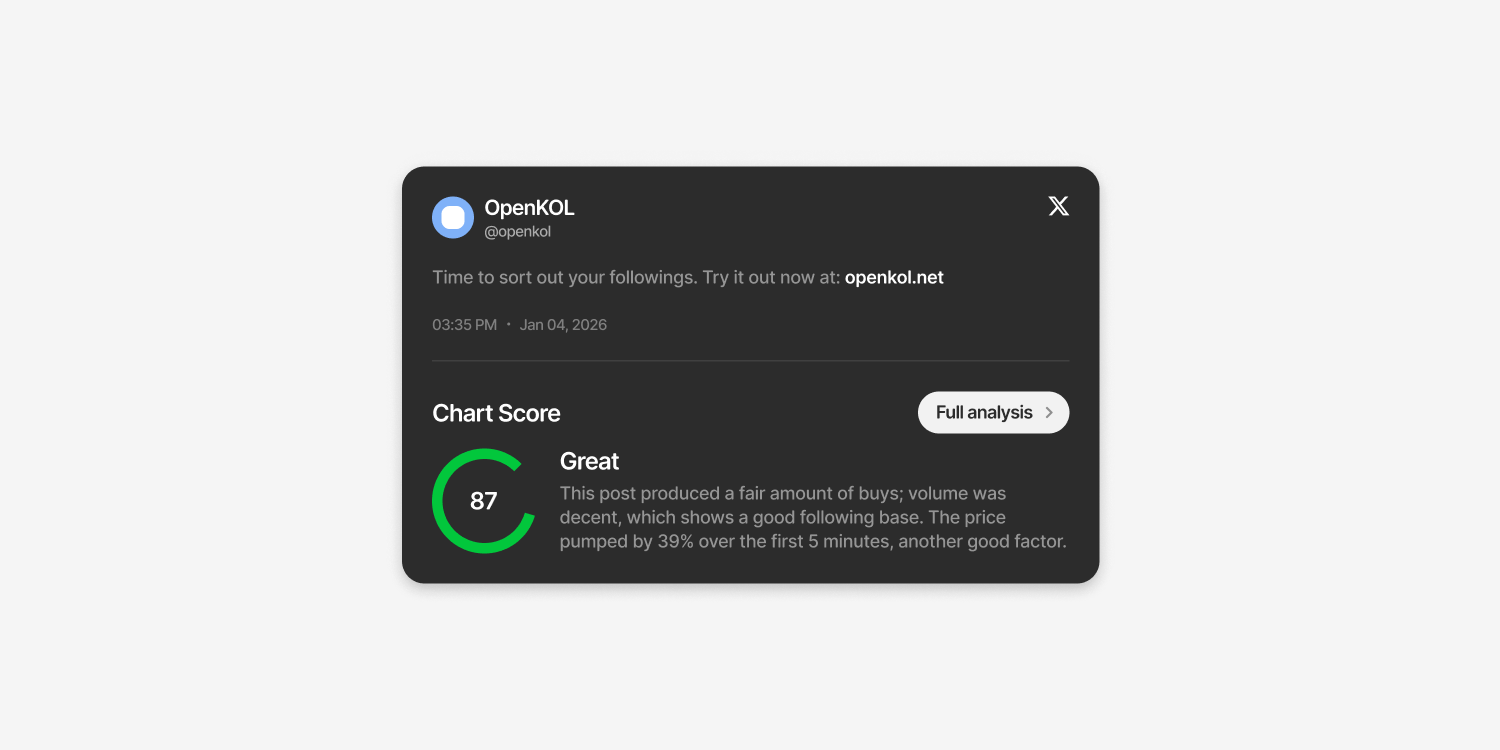
How to interpret Chart score
- High Chart = strong market follow-through after the call timestamp
- Low Chart = weak performance, poor durability, harsh drawdowns, and/or thin liquidity
- High Chart + Low Social: might be a quiet/early call that still printed
- Low Chart + High Social: likely hype without follow-through (check the drawdowns)
Why this matters
A call is not just “did it pump.” OpenKol measures:- how fast it moved
- whether it held
- how ugly the downside was
- whether liquidity made it survivable for followers